

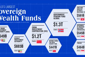
To date, only two countries have sovereign wealth funds worth over $1 trillion. Learn more about them in this infographic. Read more
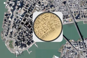
The early 1800s were a time of rapid change in New York City. This map shows the city in 1836, alongside the modern day metropolis. Read more
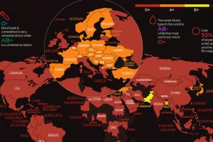
There are 8 common blood groups but 36 human blood types in total. Here we map the most widespread blood types in every country in the world. Read more
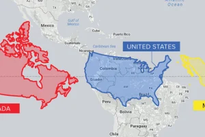
Conventional cartographic techniques have caused many to have a skewed perception of the true size of countries. Can an equal-area map provide clarity? Read more

A lot can happen in an internet minute. This stat-heavy graphic looks at the epic numbers behind the online services billions use every day. Read more
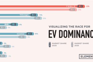
Tesla was the first automaker to hit a $1 trillion market cap, but other electric car companies have plans to unseat the dominant EV maker. Read more
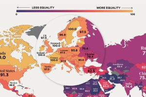
In recent years, many economies have made women’s rights a priority, yet only 10 countries in the world offer full legal protections to women. Read more

Which countries are the world’s biggest alcohol drinkers? This interactive map explores global alcohol consumption per capita. Read more
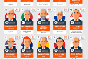
In the business world, not everyone has their career breakthrough early in life. Here are 45 late bloomers that ended up as billionaires. Read more
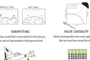
With so much data available, it’s easy to make big mistakes when analyzing and interpreting it. Here are 15 of the most common data fallacies to avoid. Read more