


Our planet supports nearly 8.7 million species. We break down the total composition of the living world in terms of its biomass. Read more
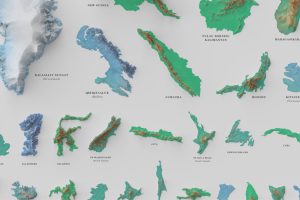
See the world’s 100 biggest islands in a side-by-side comparison. Then, we look to see which islands have the highest population densities. Read more
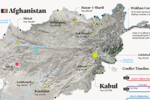
This map explainer looks at Afghanistan from a structural point of view, delving into geography and population patterns. Read more
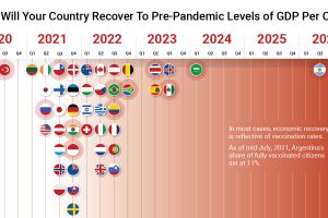
The path to COVID-19 recovery varies worldwide—some countries have already recovered, while others will not be back to normal for years. Read more
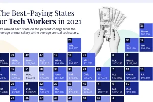
In America, tech jobs pay about 61% more than the average salary. Here’s a look at which states have the highest tech salaries. Read more
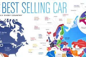
From American trucks to European sedans, this map shows the best-selling vehicles in the world. Read more
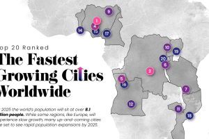
Nearly 60% of the world’s population lives in cities and this trend is not slowing down—take a look at the world’s 20 fastest growing cities. Read more
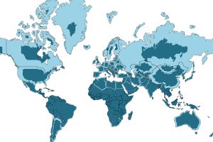
The world map you know is totally wrong. Check out this clever graphic, which helps put into perspective the true size of countries. Read more
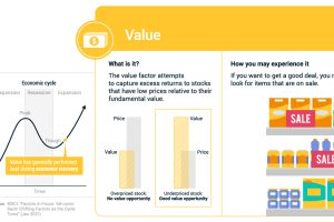
If you’ve bought an item on sale, you’ve experienced the value factor. We break down factor investing using real life examples. Read more
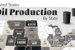
The U.S. is the largest oil producer in the world. Here we map the share of oil production in the country by all 50 states in 2020. Read more