

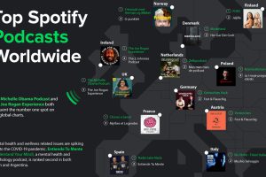
Podcasting is now a billion dollar industry, attracting big names and audiences to match. Here’s a global look at the top podcasts on Spotify. Read more
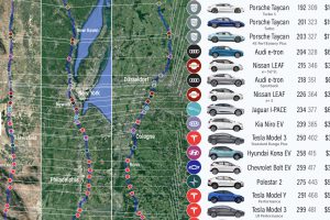
We visualize how far popular EV models will take you on real-world routes between major cities, and which are the most cost effective. Read more
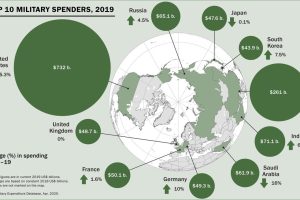
Global military spending surpassed $1.9 trillion in 2019, but nearly 75% of this total can be traced to just 10 countries. Read more
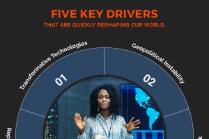
This infographic delves into five major forces reshaping our world and the new rules of leadership that CEOs should follow as a result. Read more
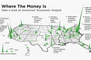
The total U.S. GDP stands at a whopping $21 trillion, but which metro areas contribute to the most in terms of economic output? Read more
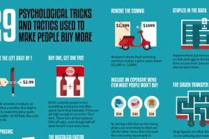
This graphic looks at 29 different psychological tricks that marketers use to try and influence consumer behavior. Read more
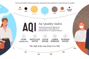
This graphic breaks down how the air quality index is measured, and looks at which regions are hardest hit by atmospheric pollution and wildfires. Read more
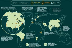
Amid the pandemic, the idea of Universal Basic Income has been gaining steam with policymakers. Where has it been tried, and has it worked? Read more
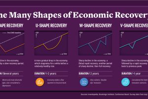
Economic recovery from COVID-19 could come in four shapes—L, U, W, and V. What do they mean, and what do global CEOs see as the most likely? Read more
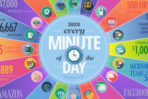
A lot can happen in an internet minute. This graphic looks at the enormous numbers behind the online services billions use every day. Read more