China already consumes mind-boggling amounts of raw materials, contributes 30.3% of global growth, and has a new spending class of 415 million millennials that is starting to demand middle class comforts.
But, if you’re still skeptical of this new economic paradigm, today’s animation shows it all in the simplest terms possible.
With one axis, each country’s percentage share of the world population is shown. Meanwhile, the other axis shows GDP per capita, roughly equivalent to the income of each citizen in that country. Multiplied by one another, or the area of the colored rectangles below, is the relative size of a country’s GDP over time.
This particular animation shows years from 1970 and include projections out until 2030:
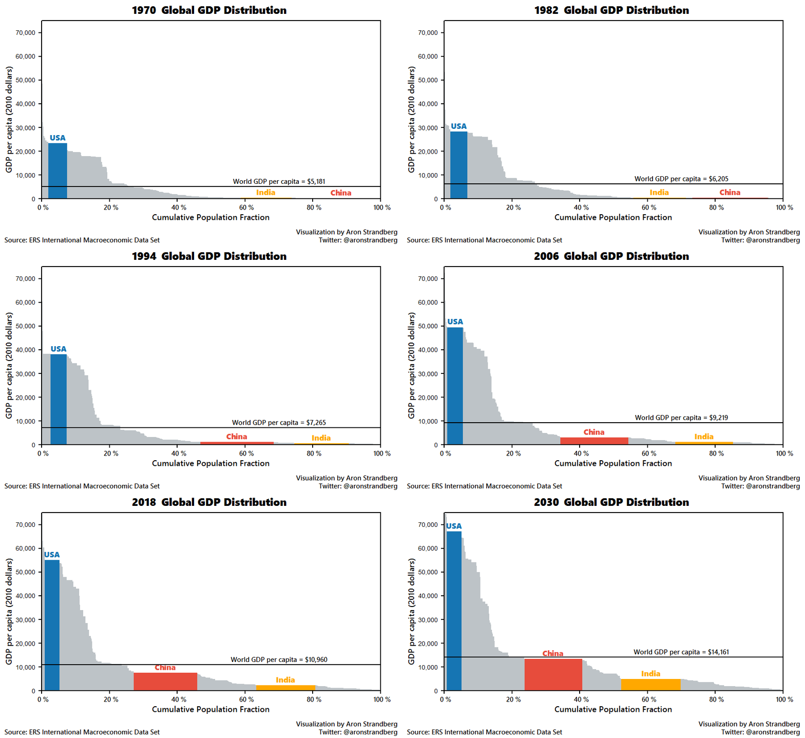
Today, the United States, China, and India make up around 38% of global GDP.
However, by 2030 it is estimated that this group will make up closer to 43% of the total. The United States’ percentage will decline from 22% to 20% of the global share. China will continue its ascent, even if at a slower pace, to make up a greater amount. India will also be the 3rd largest global economy by 2030.
Original graphic by: @AronStrandberg


