It’s a well-known fact that 60% of the world’s population lives in Asia.
Although this information isn’t necessarily new or surprising to anyone, it’s still something that we’ve found interesting ways to look at in the past. For example, last week we showed you a data visualization using bubbles to represent the populations of every country in the world, and it really helped in putting these incredible demographics into perspective.
But here’s another look at population data – and this time we think it’ll provide more surprises. The following animated chart is based on data and projections from the U.N. Population Division, and it shows the evolving population share by region between 1950 and 2100.
Visualizing Population by Region
Today’s visualization comes from German geographer Simon Kuestenmacher, who posted the following animated graph:
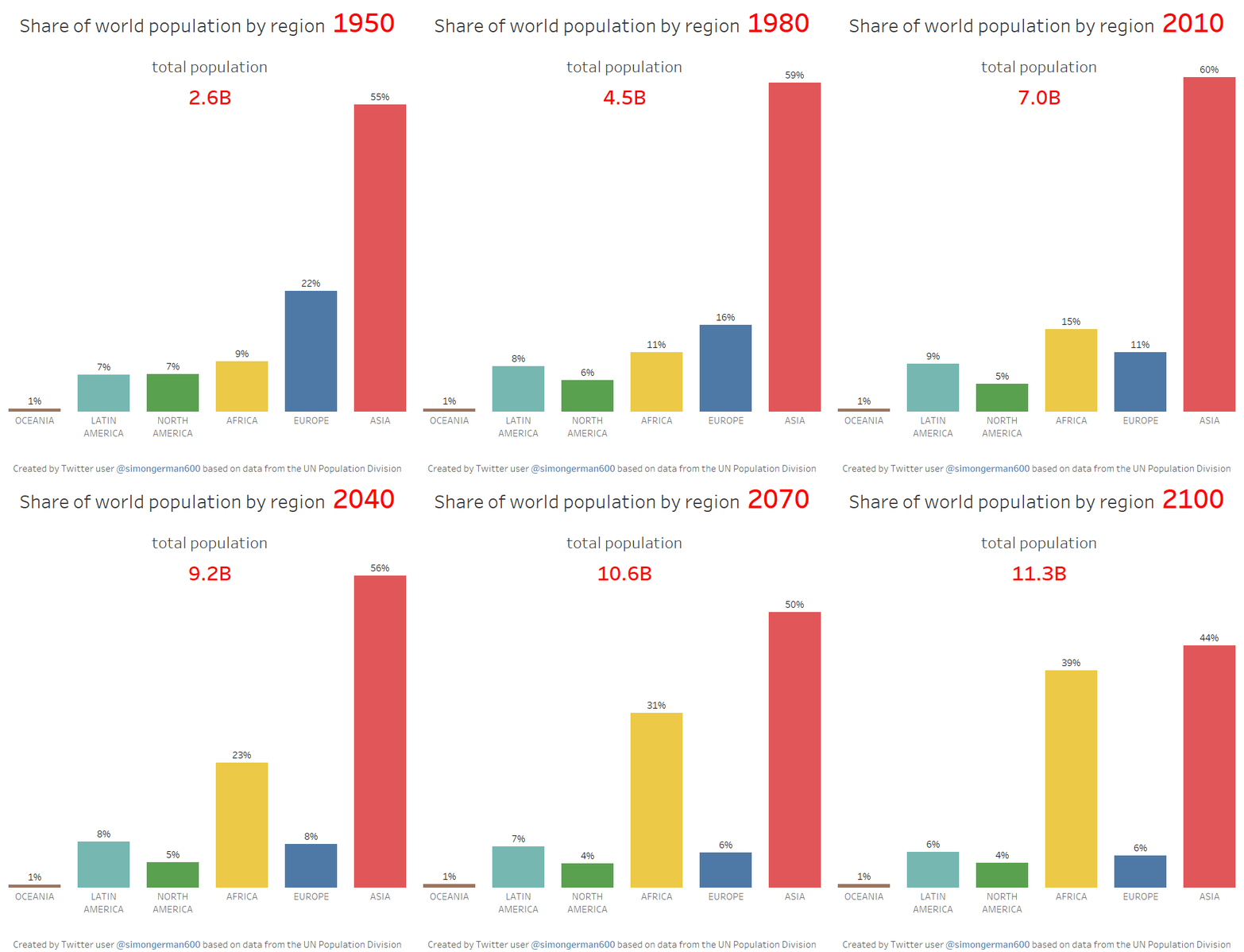
By 2100, only 11% of the world’s population will live in Northern America (United States and Canada), Europe, or Oceania.
Meanwhile, the vast majority of population growth will happen in Africa, a continent we noted earlier this week as being ripe in future economic opportunity, especially with its blossoming tech startup ecosystem.
Africa currently holds 16% of the world’s population, but by 2100 it will hold nearly the same percentage as Asia. Specifically, the U.N. Population Division expects Africa to hold 4.4 billion people by 2100, good for 39% of the world’s total.
Here are the projected tallies (in millions of people) by the U.N. for each region in 2015, 2030, 2050, and 2100:
| Region | 2015 | 2030 | 2050 | 2100 |
|---|---|---|---|---|
| Africa | 1,186 | 1,679 | 2,478 | 4,387 |
| Asia | 4,393 | 4,923 | 5,267 | 4,889 |
| Europe | 738 | 734 | 707 | 646 |
| Northern America | 358 | 396 | 433 | 500 |
| Latin America / Caribbean | 634 | 721 | 784 | 721 |
| Oceania | 39 | 47 | 57 | 71 |
| World | 7,349 | 8,501 | 9,725 | 11,213 |
It should be noted that the U.N. classifies Northern America as Canada and the United States, while Mexico is included in the Latin America and Caribbean category. Lastly, the above table is based on revised projections from the U.N., which appears to be slightly different than the data set used in the chart.


