On a global level, the World Bank estimates that although only 54% of the world’s population lives in urban areas, more than 80% of all economic production happens in cities.
Urban areas provide a combination of network effects and economies of scale that are referred to as “economies of agglomeration”. That’s why countries around the world rely on cities as engines of growth, and the United States is no exception.
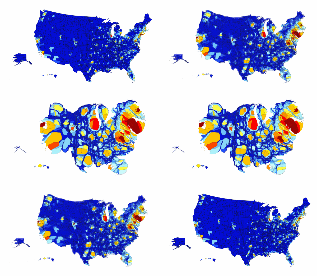
Today’s map animation comes to us from Max Galka’s Metrocosm blog, and it helps us to visualize the economic impact of metropolitan areas in the United States. The animation uses a map known as a cartogram which distorts the size of each county based on its relative economic contribution to GDP.
U.S. Map Re-sized Based on Local GDP Contributions
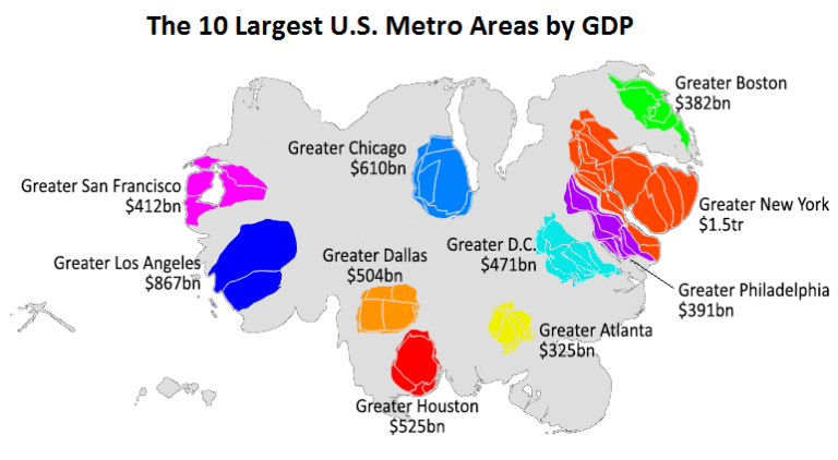
Galka also provided a static version of the cartogram which highlights the top 10 metro area economies.
Greater New York City is the heavy-hitter here with a $1.5 trillion GDP, which is about the same size as the greater areas of Boston, Philadelphia, Atlanta, and Washington, D.C. combined.
Lastly, for a different perspective on this same data on GDP by county, it may be worth taking a look at a previous post where we included a stunning 3D map that shows economic contribution by city.


