$60 Trillion of World Debt in One Visualization
Two weeks ago, we published a post showing the world economy in one visualization. In the corresponding comments section, a user asked us if we could put together a similar visualization but instead honing in on world debt.
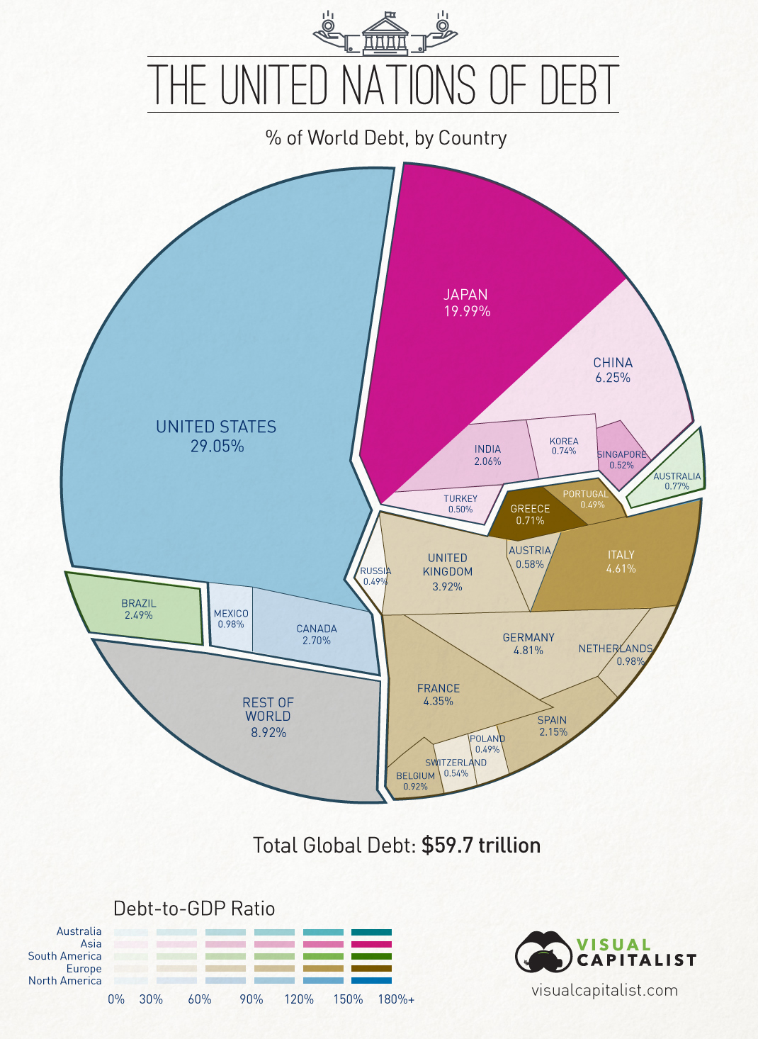
Today’s visualization breaks down $59.7 trillion of world debt by country, as well as highlighting each country’s debt-to-GDP ratio using colour. The data comes from the IMF and only covers public government debt. It excludes the debt of country’s citizens and businesses, as well as unfunded liabilities which are not yet technically incurred yet. All figures are based on USD.
The numbers that stand out the most, especially when comparing to the previous world economy graphic:
- The United States constitutes 23.3% of the world economy but 29.1% of world debt. It’s debt-to-GDP ratio is 103.4% using IMF figures.
- Japan makes up only 6.18% of total economic production, but has amounted 19.99% of global debt.
- China, the world’s second largest economy (and largest by other measures), accounts for 13.9% of production. They only have 6.25% of world debt and a debt-to-GDP ratio of 39.4%.
- 7 of the 15 countries with the most total debt are European. Together, excluding Russia, the European continent holds over 26% of total world debt.
Combining the debt of the United States, Japan, and Europe together accounts for 75% of total global debt.


