The United States is the third most populous country in the world with approximately 320 million people living within its borders.
However, the country is also the third largest in land size, giving it a wide and diverse geographical landscape. As a result of these factors, it is possible to have both ends of the population distribution spectrum.
Many people live in modern megacities, while others choose to reside in a vast countryside sparsely dotted by cottages and lakes. A small tract of land such as Manhattan has 1.6 million people living in a relatively small space. Meanwhile, a state that is 2,900x larger (Wyoming) has a more modest population of just 600,000 people in total.
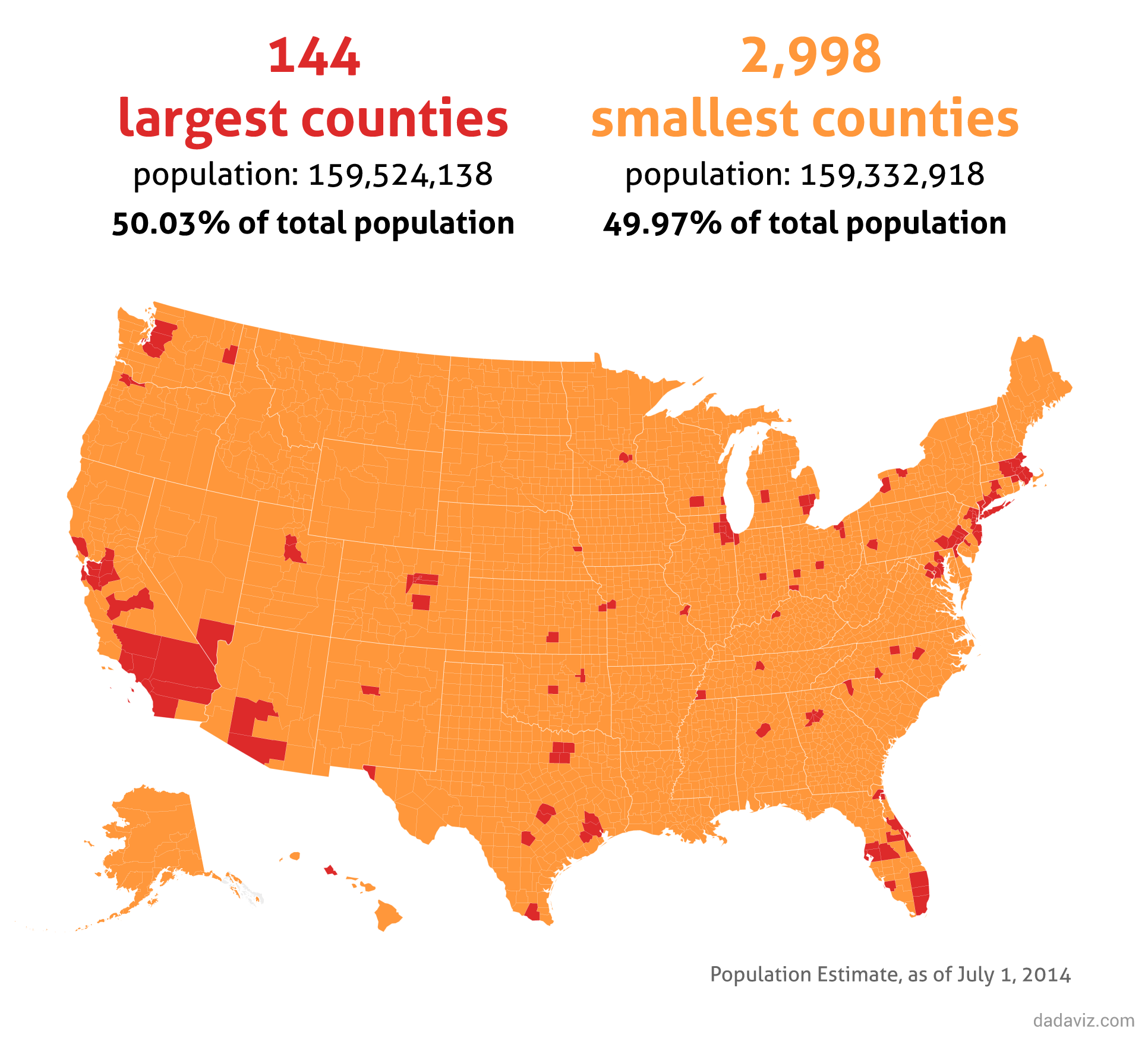
The below visualizations use data on the country’s 3,142 counties (and county equivalents) to show the extreme variance in U.S. population distribution.
1) The 144 most populous counties in the United States account for half of the country’s population:
2) The 10 most populous counties have the same population as the 2,167 least populous:
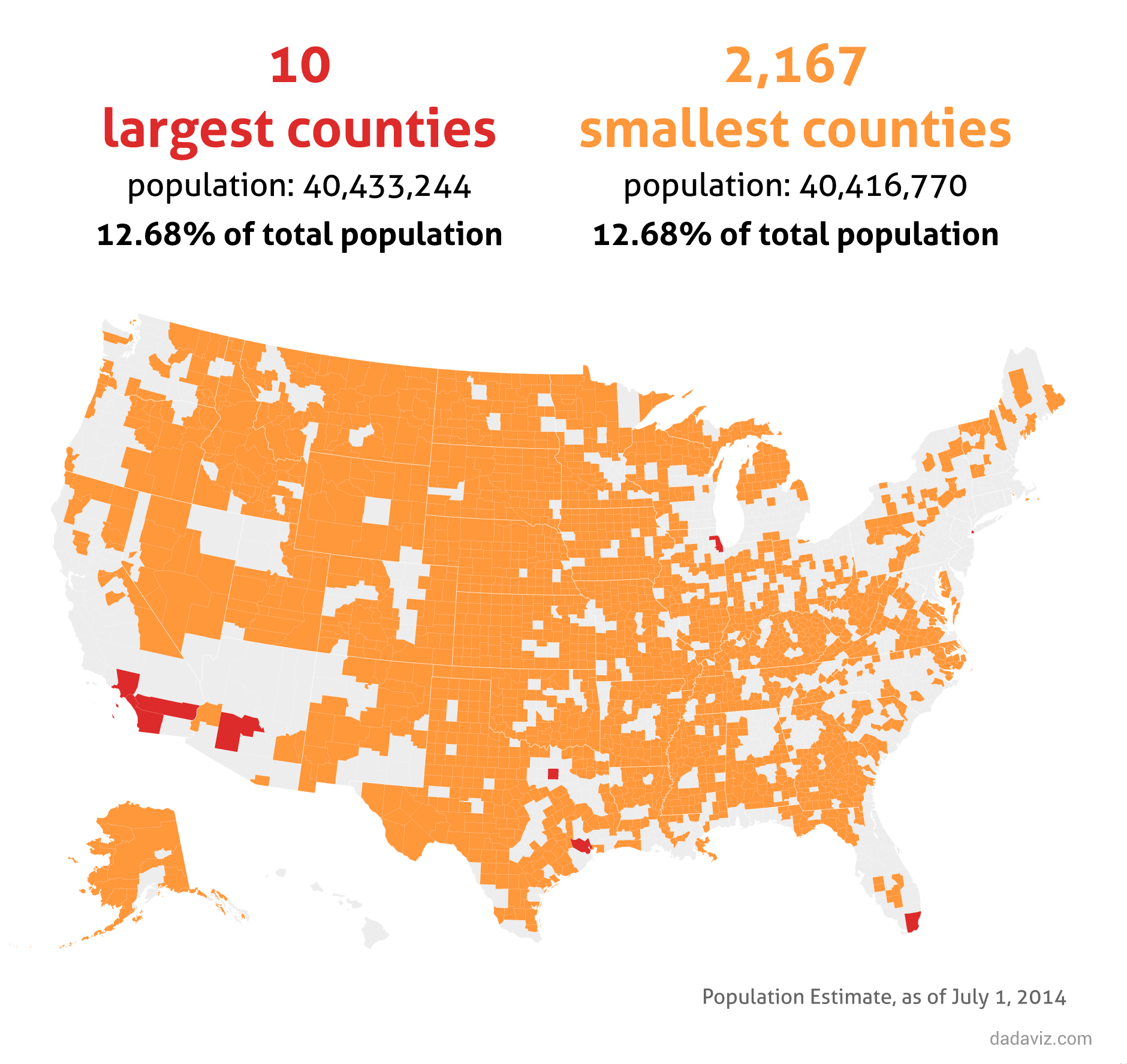
3) The two most populous counties have the same population as the 1,437 least populous:
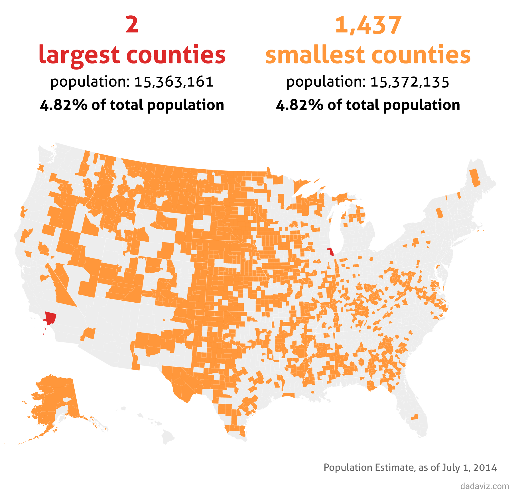
4) The most populous county (Los Angeles-Long Beach-Anaheim, CA) has the same population as the 1,171 least populous:
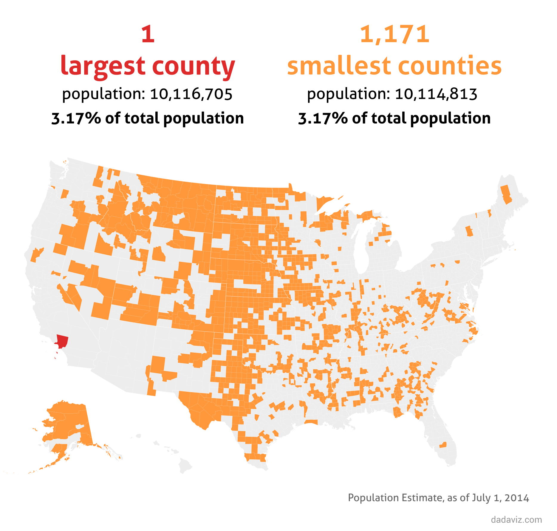
5) The most populous county has more people than the 11 least populous states:
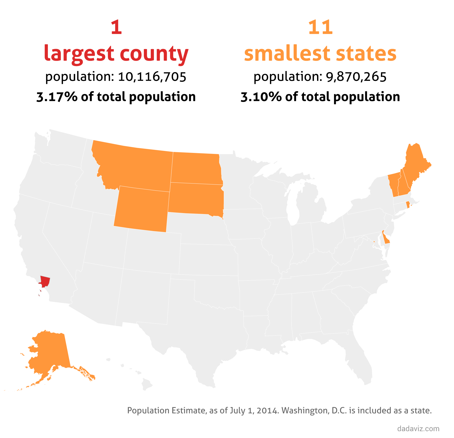
Original graphics by: Dadaviz


