

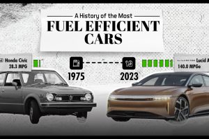
This infographic lists the most fuel efficient cars over the past 46 years, including the current leader for 2023. Read more
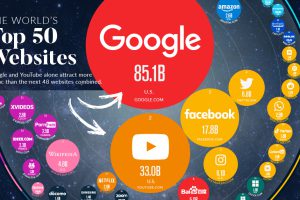
In this visualization, we rank the top 50 websites that receive the most internet traffic, from Google to CNN. Read more
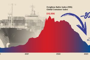
After a dramatic spike during the pandemic, shipping costs have now fallen back to Earth. What does that mean for shippers and the economy? Read more

See what the beginning of 2023 may hold, starting with our Global Forecast Report which summarizes hundreds of expert predictions. Read more
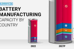
This infographic breaks down battery manufacturing capacity by country in 2022 and 2027. Read more
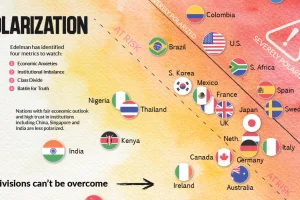
This chart plots polarization for various countries based on the Edelman Trust Institute’s annual survey of 32,000+ people. Read more
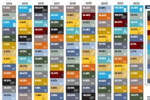
This table shows the fluctuating returns for various commodities over the past decade, from energy fuels to industrial and precious metals. Read more
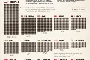
The tank remains the backbone of modern twenty-first century armies. This infographic shows what countries have the largest combat fleets. Read more
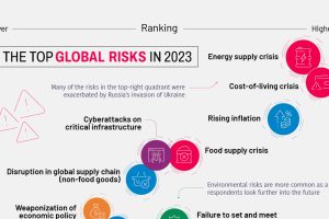
This year’s Global Risks Report highlights ongoing economic issues, such as inflation, as well as existential threats like biological weapons Read more
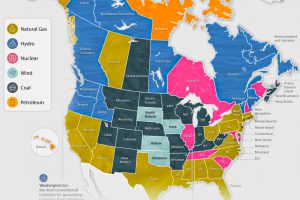
The U.S. and Canada rely on a different makeup of sources to generate their electricity. How does each state and province make theirs? Read more